
Context
Role
Product Designer
Team
Amy - UX Writer
Michael - Product Designer
Overview
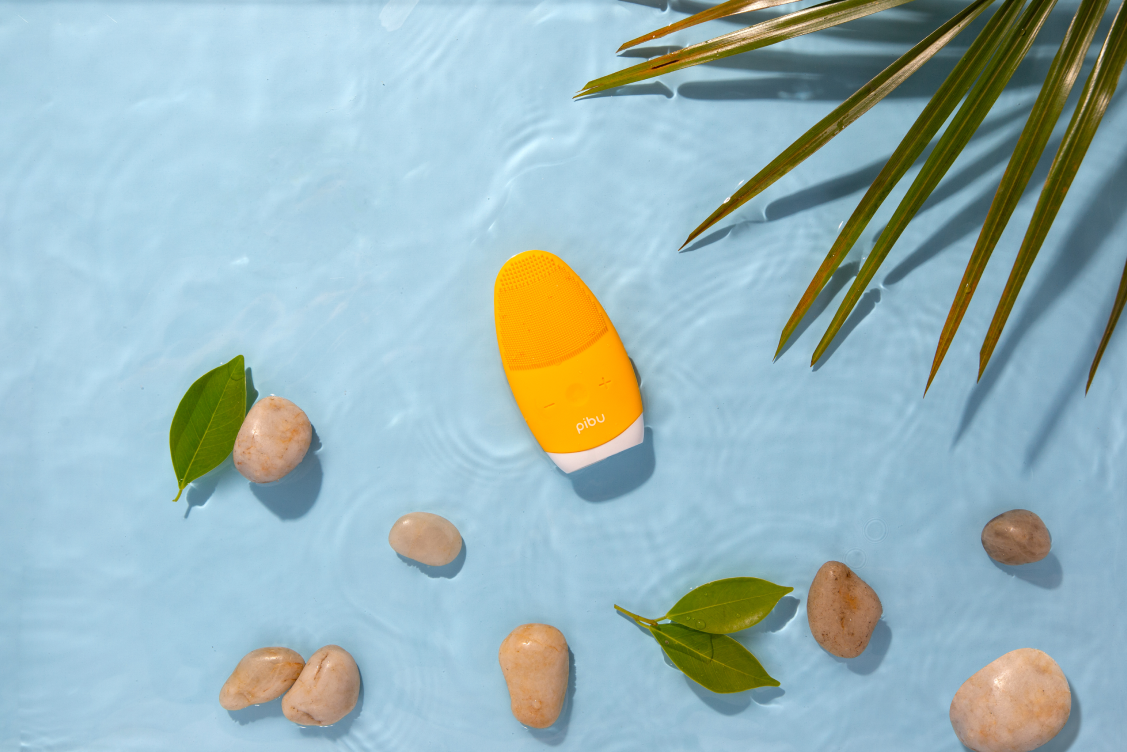
Pibu is a budding e-commerce startup looking to enter the skincare market. When I came aboard, all the two founders had was the logo, the handheld facial cleanser they wanted to sell, and a vision. As a small design team, we worked end-to-end with the founders to refine that vision and bring the brand online.
This was an exciting project as the scope was pretty holistic. I contributed to brand identity, visual direction, product strategy, user research, and website UX/UI. The project culminated in a successful development handoff and the public launch of Pibu’s brand and website.
Duration
The project ran from May 2020 through September 2020.
Challenge
How might we build trust, communicate value, and create a seamless e-commerce experience that differentiates Pibu in a crowded skincare market?
Research
Kick-off
Prior to the initial meeting, we had the client fill out a prepatory questionnaire in order to get better acquainted with the project's context. At the kick-off meeting, we got to know one another a bit before discussing expectations, decisions, constraints and assumptions. This established the foundation for a plan of approach, scope of work, rough timeline and a close working relationship. Our approach started with utillizing generative research methods to understand who our customers were, and their habits, preferences and pain points.
Survey
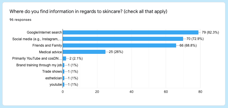
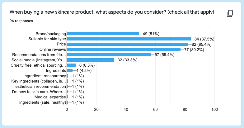
We created a survey to quickly gather data to see how people view the industry, their habits, needs and desires in relation to skincare.
Most participants relied on Google searches, social media, and word-of-mouth recommendations when researching skincare.
Purchase decisions were driven primarily by skin-type compatibility, price, and online reviews.
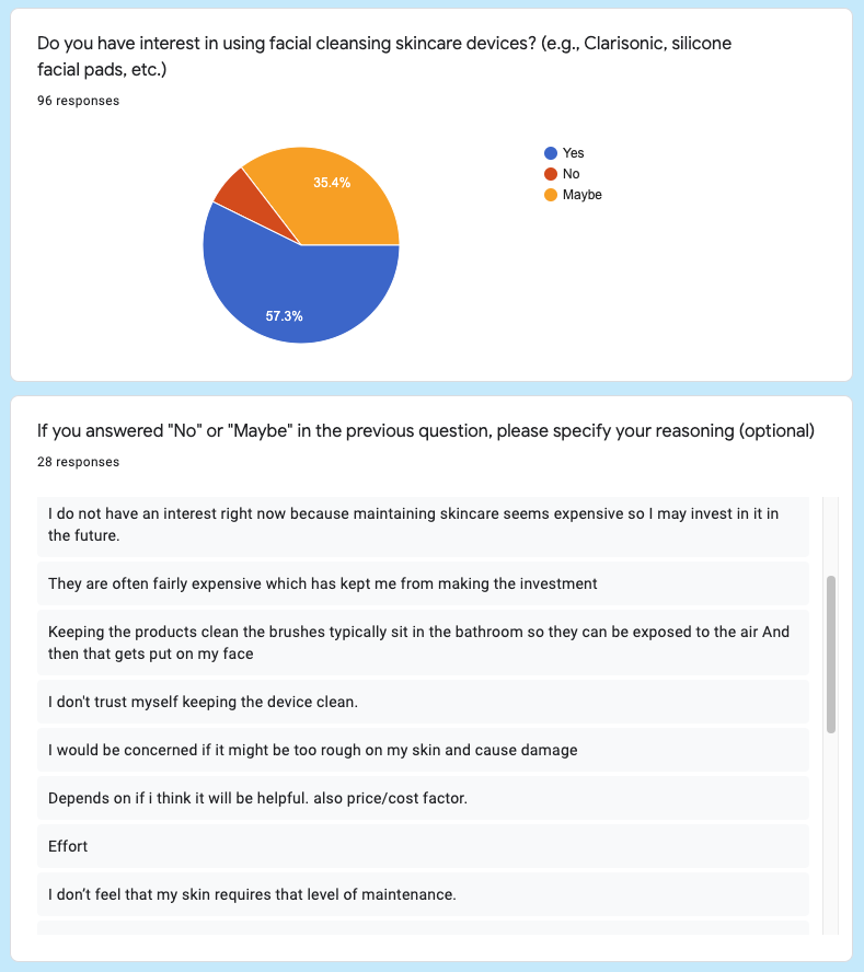
Customer experience with and opinions on skincare devices
Interviews
Using the survey as a precursor, we came up with an interview script to dig deeper into skincare goals, habits, and online shopping experiences. Nine interviews yielded rich insights and revealed some consistent patterns.
Competitive Analysis
We identified two direct competitors selling similar products in the same skincare device space. Foreo is a well established brand with a wide reach in the market. Meejee is small, hip brand that's new on the block. Clarisonic, the biggest name in the game shut down in 2020. We completed Strengths, Weaknesses, Opportunities, and Threats (SWOT) analyses for Foreo and Meejee in order to identify ways Pibu could differentiate itself and rise above the competition.
Analysis
Research Results
All of the conducted research helped us get a clear picture of who our intended customers are and how to connect with them. Through affinity diagraming all of our data, we extrapolated themes to guide our design strategy.
Affinity Diagram
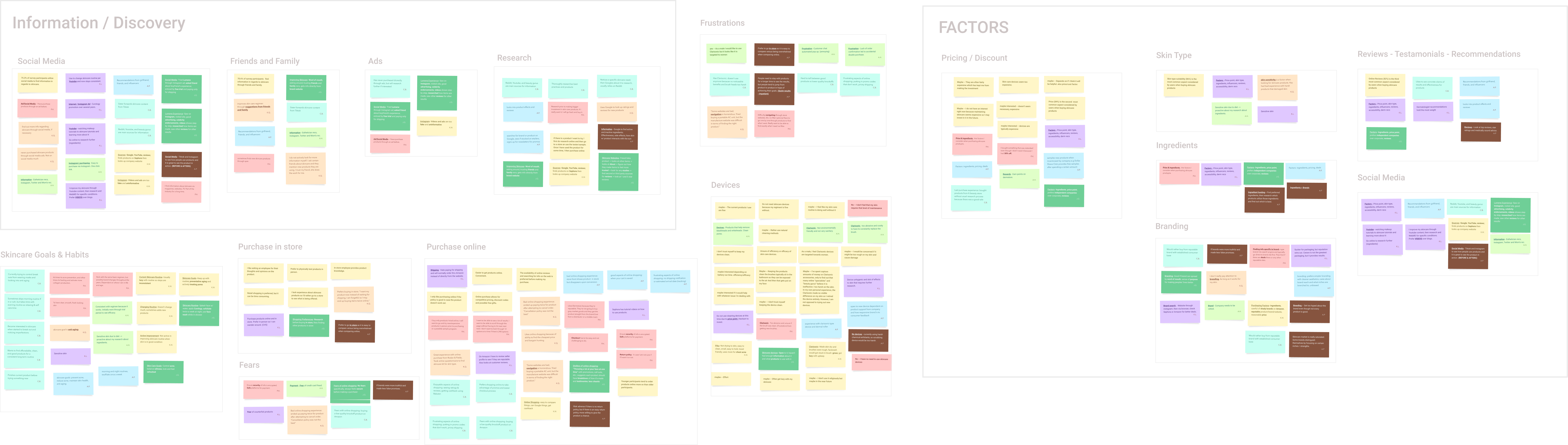
Themes
1. Convenience
Customers prioritize convenience. On the product side, ease of use and minimal upkeep matter as much as performance. On the e-commerce side, the shopping journey should be intuitive and frictionless. This insight shaped our approach to both product messaging and UX decisions
2. Trust
Trust reflects a customer’s expectation that a product and the company behind it will deliver on its promises. Because skincare is deeply personal, credibility is integral to adoption. Customers build trust through reputability, visible results, and strong social proof. This insight reinforced the importance of transparent messaging, proof of performance, and signals of legitimacy throughout the brand's marketing channels and e-commerce experience.
3. Value
Customers approach skincare purchases carefully, often researching products in depth before committing. Value isn’t just about cost, it’s about confidence that a product is high quality and dependable enough to support long-term use in their routines. Customers want to avoid the frustration of having to revamp their routines or experimenting endlessly.
Brand
Exploration
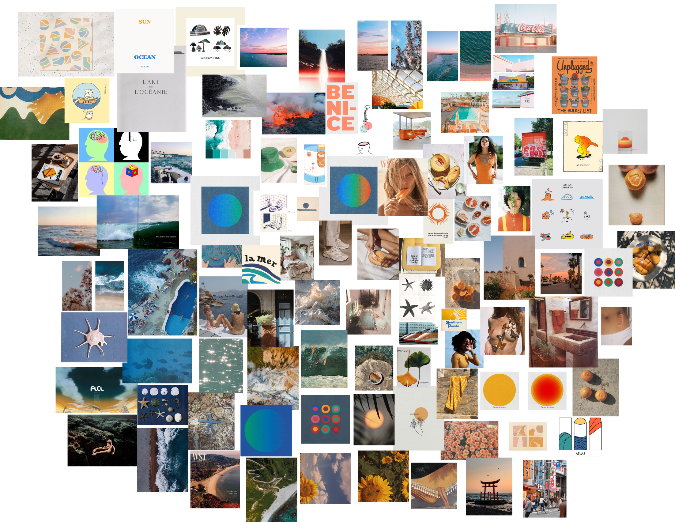
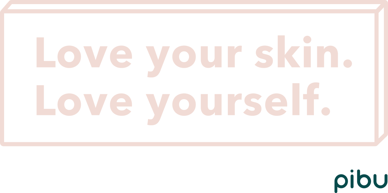
A brand is more than just the product being sold. A brand is the promises it makes, the principles it represents, the messages it sends, the emotions it evokes, the vision it shares, the value it provides. A brand is an identity that people can connect with. We envisioned Pibu's brand identity to be playful, friendly, authentic and trustworthy. With the brand being based in Orange County, California, we translated that context into a warm, coastal visual language designed to feel refreshing, relaxed, and uplifting.
Mood Board
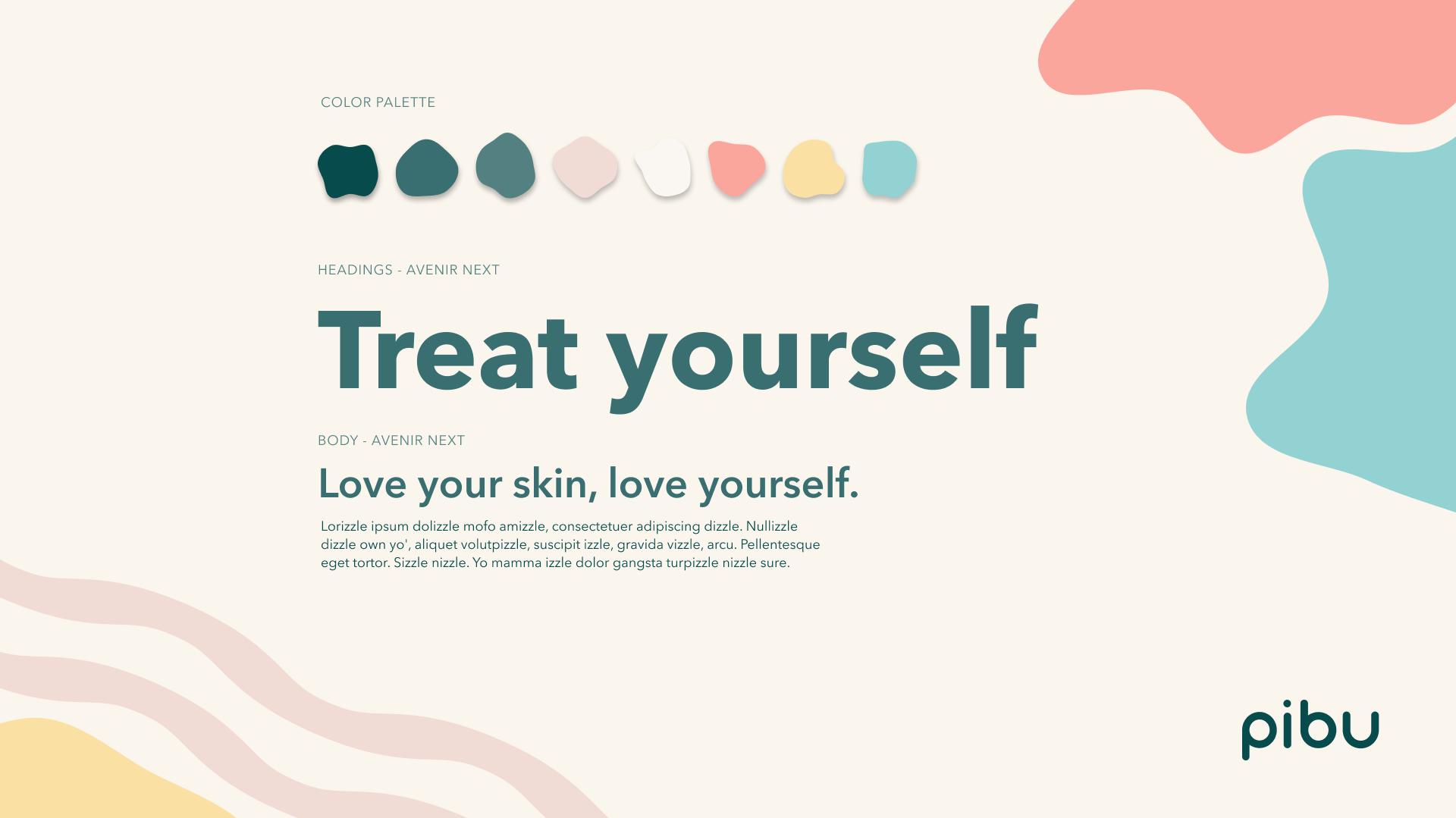
Visual Identity
Positioning
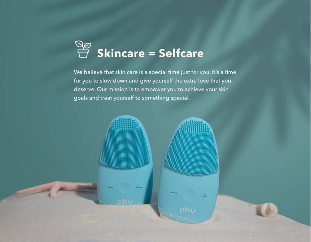
We aimed to position Pibu’s voice as human, relatable, and trustworthy. Our priority is to improve our audience’s quality of life by helping them feel confident in their skin. We believe that skincare extends beyond the superficial. Skincare is an act of self-care that empowers our audience to live their best life. We want to connect with our audience by being accessible and empathetic towards every person’s unique skincare journey.
Pibu’s voice is human and relatable. The brand acts as a supportive companion in customers’ skincare journeys. Our goal was to build emotional accessibility: a brand that feels welcoming, empathetic, and easy to trust. We framed skincare as an act of self-care and a daily ritual that supports confidence and well-being. By positioning the product within a broader lifestyle narrative, we aimed to connect with customers on a deeper level and reinforce brand loyalty.
Website
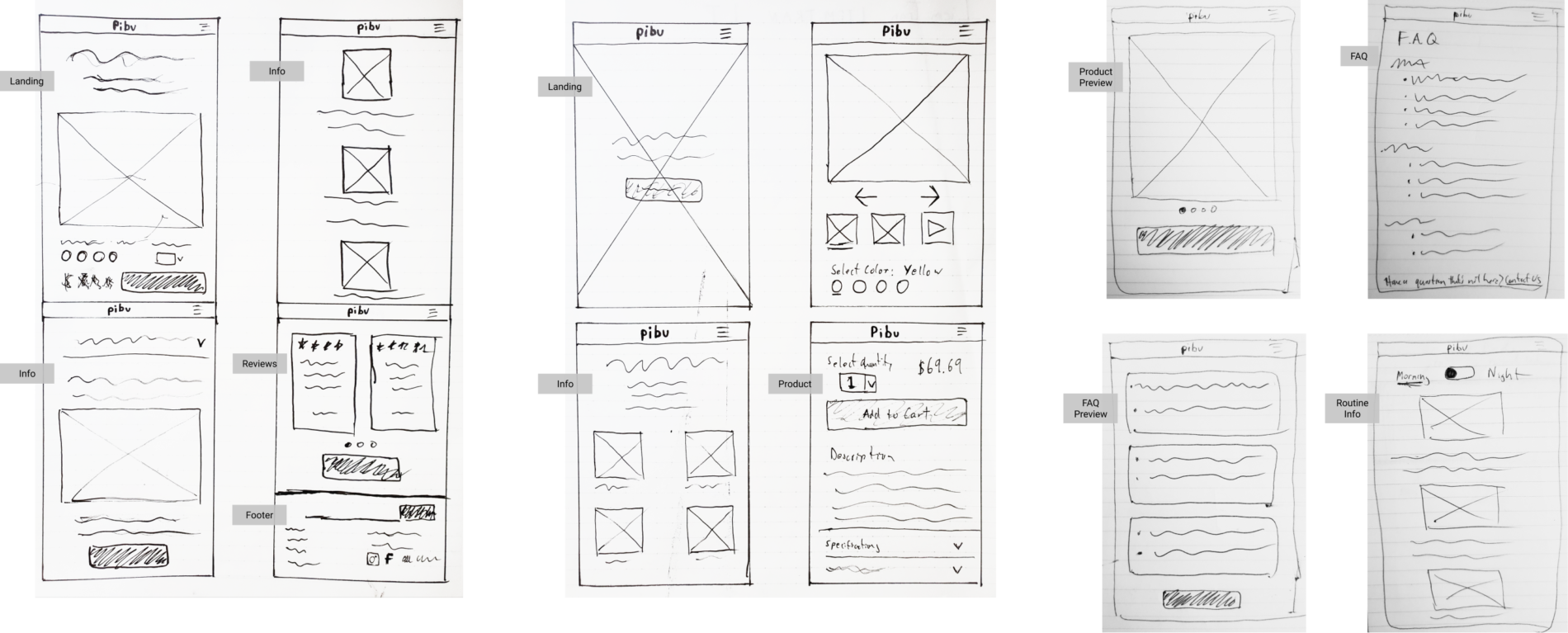
Low Fidelity Wireframes
We began with low-fidelity wireframes to quickly explore structure, hierarchy, and the core shopping journey. This early phase allowed us to align on layout and information architecture without getting attached to visual details.
We opted to design for mobile first. Designing for mobile devices comes with a big constraint in screen sizes. That means we needed to take a look at all of our content and work out a visual hierarchy depending on how important it is to our customers. With Instagram being Pibu's main marketing channel, we figured there would be a sizable amount of mobile visitors to the website.
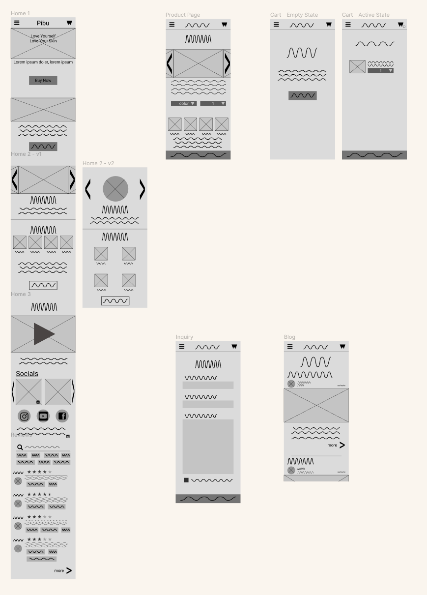
Mid Fidelity Screens
Through iterative design cycles, we refined the wireframes into mid-fidelity prototypes where we tested key decisions around navigation, product storytelling, and conversion flow. We conducted A/B comparisons to evaluate alternative approaches and validate which directions to take. We also had some users perform tasks around the website for us to observe and recieve feedback.
Mobile Landing Page Prototype
Finish Line
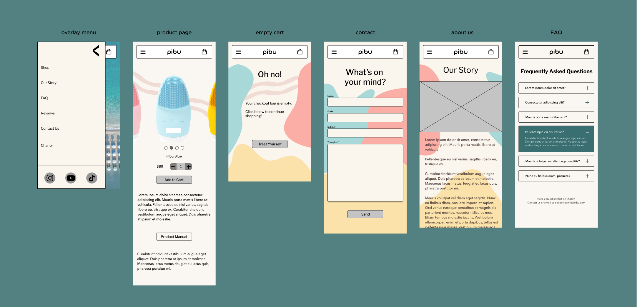
Final Product
After going through what seemed like countless iterations, we arrived at a finished design that everyone was happy with.
Mobile Screens
Desktop Screens
Developer Handoff and Launch
We built a design system that allowed the developer to build the site efficiently while preserving consistency and leaving room for future changes.
After handoff and through the launch, we stayed closely involved during implementation to clarify any questions or issues.
Following release, we conducted a thorough audit of the live site and documented usability issues and opportunities for improvement, pairing each finding with actionable recommendations. Check it out below.
Retrospective
This project gave me perspective on how much thought, discussion, and deliberation goes into even the seemingly smallest of design decisions such as spacing or wording. But it's the culmination of all those little details that shape perception and trust.
Working closely with both my teammates and the founders showed me how important communication and organization are in collaborative work. When everyone is has context and clarity, decisions just tend to move faster. I think this is especially true with remote collaboration, which was the case with this entire project.